Tag Archives: improve

excel 2011 review

Excel for Mac 2011 (Review)

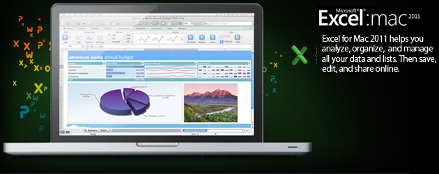
Microsoft has released Office 2011 for the Mac, and we’ve already looked at the new versions of PowerPoint and Word in the suite. Now it’s Excel’s turn. How does the updated spreadsheet program compare to the dismal reputation of its predecessor?

Look and Feel

Excel 2011 brings in the ribbon interface. As I mentioned in my look at Word 2011, I actually like it. The Windows version of the ribbon I found to be much more panic-inducing because it pretty much gets rid of all the menu bars. Not so on OS X; you get to have your cake and eat it, too.

The ribbon actually takes up less overall room than its equivalent in Excel 2008. The screenshot below shows the Excel 2008 on the left, and Excel 2011 on the right. You can also minimize the ribbon by single-clicking on a tab header. If you don’t like it, you never even have to see the thing. It’s definitely nice to have the option, either way.

Show Me The Money: Getting Your Work Done

Overall, Excel 2011 feels much more responsive than 2008. For starters, I can now launch the app without being able to microwave popcorn before it fully loads. I did notice some sluggishness when it loaded the template chooser, but you can easily skip that screen. Speaking of templates, while I found the supplied Word templates weren’t that special, I was impressed with those supplied in Excel. There are a few (invoices and general finance) I can actually use, a first for Office.

One interesting new feature is Sparklines. Basically, Sparklines is a handy way to trend data. In the screenshot below, we’re tracking quarterly sales by region. The in-cell chart is a Sparkline showing the trending data. We can tell at a glance that the Boston region is doing quite well, while the manager of the Los Angeles region might want to shop his resume. You can set a Sparkline to be a line, bar, or win-loss chart. I can see using it to trend my freelance business.

Conditional formatting is much improved in 2011. Put simply, conditional formatting allows you to set rules to highlight cells that meet a given criteria. Keeping with the sales data, I can set up a condition to highlight any cell with a number less than 100.

There’s a couple of weird gotchas, though. When I opened the document review spreadsheet I mentioned earlier, I wanted it to show me documents that had been modified during a specific date range. While you can choose “dates occurring” from a pull-down, it’s a fairly narrow range. Instead, I had to set the cell data range in a separate pulldown. It’d be nice if there was an option to set that range right in the “dates occurring” section. Still, the older version of Excel was much more limited, so these improvements are welcome.

One cause for complaint in the new version of Excel is the lack of support for Snow Leopard services. In my Word article, I mentioned how happy I was that Word handled these well, but sadly, the same can’t be said for Excel 201. Highlighting a section of text and choosing Services just gives you a grayed-out “No services apply.” I believe this is due to the Carbon underpinnings of Excel, as it seems Services require the app to be programmed in Cocoa. Whatever the reason, it’s a shame it’s not in there.

Back to the Macro

Thankfully, Visual Basic macros are back. As I said, I’ve never been a big VB user, but the lack of them really messed up Windows compatibility.  While I never created them, I’d get enough spreadsheets containing them to shake my fist in Redmond’s direction whenever I tried to open sheets in Excel 2008. It’s nice to see things are back to normal.

Closing the Books

I’m pretty happy with Excel 2011. The interface is cleaner, and I didn’t notice some of the slowdowns other reviewers have mentioned, but the largest sheet I opened was about 1000 lines. Sparklines, corny name aside, seems like a good, albeit situational feature. I’m happier with the improvements to conditional formatting. The big reason to upgrade, though, is the return of Visual Basic macros. It’s hard to praise that return too much, though, since it really feels like we’re paying a premium just to get an old feature back.

word 2011 review

Word for Mac 2011 (Review)

Word 2008 quickly fell out of favor with me. It was horribly slow, and struggled to keep up with itself. If Word 2011 did nothing more than feel faster I’d consider it money well spent. But Microsoft went beyond that with the new version, just as it did with PowerPoint.

New Features

The Office suite has been criticized for being bloated, but I’m reminded of the old adage “You can only please some of the people some of time.” Or, in software terms, “One person’s bloat is another person’s critical feature.”

Take the return of Visual Basic macros. Reviewers are praising its return from the mountaintops, but I’ve never used the feature and didn’t miss it. However, the addition of an equation editor while I’m the midst of my first algebra class in 20 years has me positively giddy.

An academic annoyance that’s not Microsoft’s fault is that EndNote, a popular citation management program, isn’t yet compatible with Word 2011. While Word does have its own citation manager, I’d rather see EndNote support, as it can connect to my university’s library and grab all the relevant information.

The Ribbon

The ribbon interface from the Windows version also makes its appearance in Word 2011, although there was a sort-of-proto-version in Word 2008. Much wailing and gnashing of teeth has occurred since the announcement, but after finally getting my hands on, I find it helpful. You can easily make it go away with one click, but I don’t recommend it; spending some time figuring it out will pay dividends in increased productivity later.

My biggest complaint with the ribbon is, oddly, that not everything is on it. Word 2011 has a nice full screen view — similar to Scrivener’s — but it can only be accessed via the View menu. While ribbon-haters may cheer this, it can slow learning down as you stop to check whether something is on the ribbon or not.

Toolbox and Services Integration

Also not fully migrated to the ribbon is the old Toolbox. In Word 2008, the Toolbox was where you’d do a lot of heavy lifting. It’s still there, and it’s where you edit styles and insert citations. While you can right-click on a style in the ribbon to modify it, I found the Windows way of doing things a little more user-friendly.

Snow Leopard’s improved Services seemed to catch Word 2008 by surprise. Selected text, for instance, didn’t a trigger a text-related Service. Fortunately, that is much improved, as Word 2011 sees text as, well, text. Native support for accessing your iPhoto library is also included. Previously, this required a custom Service to work.

General Usage

Ok, now that we’ve gotten what’s new, different, and the same out of the way, how is Word 2011 in actual usage? Pretty darn good. Word 2008 was so bad an experience for me, I’d switched to Pages. It was faster and more stable, and I don’t collaborate enough with Office users for issues to really arise.

However, Pages is also a consumer-level product. My day gig is a technical writer for a large corporation, and there’s no way I can do that work in Pages. It’s just not equipped for heavy lifting. Another big benefit for work is that Word 2011 can now “paste and match formatting” right from the menu bar. Gone is the need for several mouse clicks to do a simple task.

The only crash I’ve encountered in my admittedly light testing was a hang up with sharing a document. By now, Word 2008 would’ve thrown several fits. I tend to agree with Gartner Analyst Mike Gartenberg, who tweeted “Totally love the new Office for Mac. Possibly best version of Office. Ever.” Given speed advantages alone, Word 2011 is going to be one of my go-to text wranglers. My general plain-text and creative writing will still be done in Scrivener, but all my school and business work will happily go to Word 2011.

A More Versatile Word

I’ve been very, very impressed with this version. I threw a couple of worst-case documents at it — custom templates with imported Visio documents created on the PC, and a user guide I created with a boatload of graphics — and it didn’t hiccup. If, like me, you thought Word 2008 was a blight upon the land, I think you’ll be pleasantly surprised with Word 2011. If you’re an academic user, with the built-in citation and equation management, Word is clearly the leader here. If you’re using Word for work, then the time saved thanks to speed boosts and fewer crashes will go even further toward justifying the cost.

ppt 2011 review

PowerPoint for Mac 2011 (Review)

Let me start by saying that if you’ve given up on Office for Mac after the disappointment of 2008, you should have another look at the latest offering. I feel like the Mac department over at Microsoft is finally getting the support and resources it needs from corporate to give its products a fighting chance alongside Apple’s own offerings.

General impressions aside, here’s what you need to know about the new PowerPoint.

More Windows and More Mac, All at Once

Amazingly, Microsoft managed to make the new PowerPoint interface feel more like its Windows-based twin, while also changing the design so that it looks more at home on the Mac desktop. One of the features that helped the new design is the inclusion of the ribbon. Yes, it’s a controversial feature, and many Windows users don’t like it, but I’ve grown accustomed to using it, and I welcome its inclusion on the Mac side of things.

The ribbon, for those who haven’t tried any recent editions of Office for Windows, resides at the top of your interface underneath the tool bar. Commands and tools are organized by sections, like “Home,” “Theme,” “Charts,” “Slide Show,” etc. If you’re used to hunting around in menus for Office commands, you probably won’t like them, but for those new to the suite, it’s a much more logical means of organization.

Office 2011′s ribbon has all the same content as the Windows version, but it looks decidedly Mac, as you can see from the screenshots, so there’s no confusing what environment you’re working in. You can easily hide or show the ribbon, so it doesn’t get in the way of the presentation you’re working on. You can also customize it by rearranging tabs and changing commands, so there’s really no reason to dislike it unless you just prefer things not change.

Slide Layers Make Everything Easier

It’s hard for me to even convey how frustrating it is to manipulate the order of objects in past versions of PowerPoint, especially in presentations and slides where you’ve got a lot going on. I used to work at a company where we used PowerPoint as print publishing software, so that should give you some idea of how complicated layouts could get.

The new Reorder Objects tool in PowerPoint 2011 allows you to easily manipulate even the most complicated slides pretty easily. It looks like the new Windows 7 Flip 3D feature, fills your whole screen, and lets you click and drag layers to rearrange. No more hoping this is the last time you have to click “Send Backward.”

Media Manipulation

PowerPoint 2011 approaches the simplicity Keynote has in terms of adding media. You can use the Media Browser to drop photos, music and video in from various sources, including your iTunes, iPhoto and iMovie libraries. Even Aperture showed up in the source menu in my tests.

You can also edit stuff more easily — and with more options — from within the app. Doing basic retouching on photos is quite easy, and about on par with what you can do in iPhoto, only without having to leave the app. PowerPoint also has some other neat image editing functions, like the Remove Background tool I used to cut out Justin Long and John Hodgman in the screenshot below in about 30 seconds.

Better Cross-Platform Access and Collaboration

Working together with distributed teams is easier with the new PowerPoint, since you can collaborate wirelessly in real time, and communicate with each other via Live Messenger or Communicator. Plus, you can access and make changes to your presentations on the go with the PowerPoint web app. Finally, publishing your slide show to the web so that it’s viewable by others is a snap, and your audience doesn’t need to have the program to take part.

There are still some limitations to using PowerPoint 2011 on the Mac. You can’t access your presentations on the web from your iPhone’s or iPad’s browser, for example, and I still think presentations made in Keynote might look a little better, too.

Overall, that’s about all I have to say against PowerPoint 2011. Earlier today on Twitter I asked how many still used Office for Mac in some capacity, and was surprised to find that a lot of you still do. That Microsoft is delivering software at this level is great news for those users. If I was still in the business of regularly making presentations, this is definitely the tool I’d use to get the job done. In fact, it may just inspire me to include a slideshow the next time I give a talk.